Be Proficient in Data Visualisation with Looker Studio’s Versatile Line Charts

Be Proficient in Data Visualisation with Looker Studio's Versatile Line Charts

Line charts in Looker Studios serve as powerful tools for visualising trends and patterns in data over time. They are commonly employed in various industries for tasks such as tracking sales performance, analysing stock trends, and monitoring changes in key metrics over different time intervals.

Advantages of Line Charts for Data Visualization:

Line charts offer a clear representation of data trends and variations over time, providing a visual narrative of how metrics evolve. Their simplicity aids in immediate comprehension, making them effective for conveying temporal relationships and identifying patterns or anomalies within datasets.

Types and Categories of Line Charts in Looker Studios:
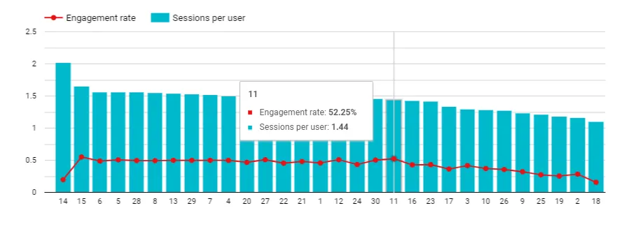
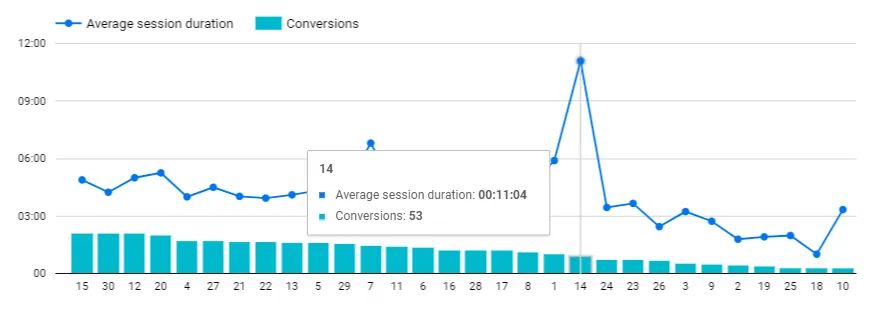
1. Combo Chart:

The Combo Chart in Looker Studios seamlessly integrates line, bar, and area charts into a single, cohesive visualization. Imagine assessing marketing campaign performance. The Combo Chart could showcase clicks (line chart) alongside the cost (bar chart), and illustrate the cumulative spend trend (area chart), offering a comprehensive view of the campaign’s effectiveness over time.
ComboChart
For Example: Consider a marketing dashboard tracking the performance of online ads. The Combo Chart displays the clicks (line chart), ad impressions (bar chart), and the cumulative cost trend (area chart). This enables marketers to discern the impact of their campaigns, understanding both engagement levels and expenditure trends.

2. Stacked Combo Chart:
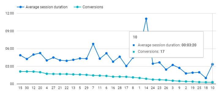
The Stacked Combo Chart combines the strengths of stacked bar charts with line charts. It’s a powerful tool for illustrating both part-to-whole relationships and temporal trends simultaneously. In a manufacturing context, it could showcase total production output (line chart) stacked by individual product categories (stacked bar chart), providing insights into both overall production trends and the contribution of each category.
For Example: In manufacturing, the Stacked Combo Chart can represent total monthly production output (line chart) stacked by product categories such as electronics, textiles, and machinery (stacked bar chart). This visualisation offers a holistic perspective on production trends and the proportional contribution of each category.

3. Line Chart:

The foundational Line Chart represents data points through connected lines, providing a straightforward depiction of trends over time. For instance, in a sales analysis, a Line Chart can effectively showcase monthly revenue, allowing stakeholders to identify patterns, seasonality, and overall performance.
For Example: In a retail setting, a Line Chart could visualise monthly sales figures. The line would connect data points representing each month’s revenue, offering a clear representation of the sales trend. This facilitates quick insights into sales patterns and helps in forecasting future performance

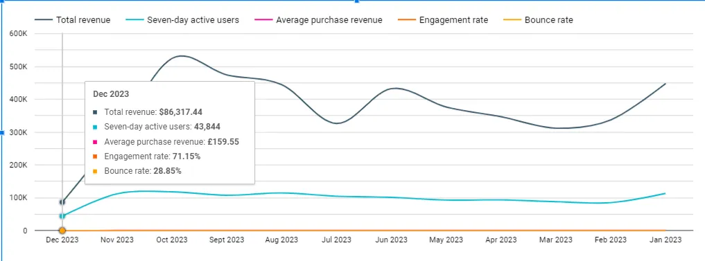
4. Smoothed Line Chart:
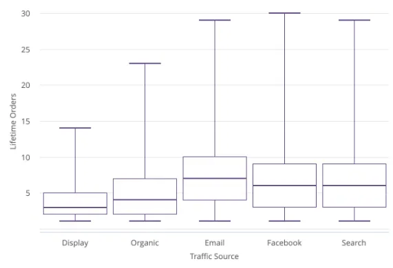
The Smoothed Line Chart refines the traditional line chart by applying a smoothing algorithm. It reduces noise, providing a cleaner representation of overarching trends. In weather data visualisation, a Smoothed Line Chart could display the overall temperature trend over a month, emphasising broader climate patterns while minimising daily fluctuations.
For Example: For weather data, a Smoothed Line Chart might display the monthly average temperatures. The smoothed line reduces daily temperature fluctuations, offering a clearer view of the overall temperature trend throughout the month.

5. Boxplot Chart:

The Boxplot Chart introduces statistical depth to visualisations by presenting key metrics of a dataset’s distribution. For example, in employee performance ratings, a Boxplot Chart could display the median, quartiles, and outliers, providing a comprehensive assessment of the rating distribution within a team.
For Example: Consider a human resources dashboard analysing employee performance ratings. The Boxplot Chart showcases the distribution of ratings within a department, providing insights into the team’s overall performance, identifying outliers, and facilitating targeted interventions.

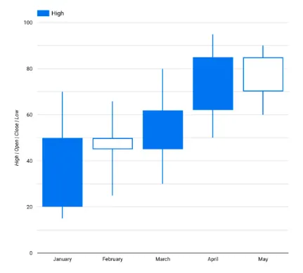
6. Candlestick Chart:

Primarily used in finance, the Candlestick Chart visually represents stock price movements. It displays opening, closing, high, and low prices over a specific time frame. In stock market analysis, a Candlestick Chart can reveal patterns and trends, aiding traders in making informed decisions based on historical price data.
For Example: In stock trading, a Candlestick Chart could illustrate the daily price movements of a particular stock. Each candlestick represents the opening, closing, high, and low prices, offering traders a visual tool to identify price trends, reversals, and market sentiment.

Clutter Avoidance in Line Charts:

To avoid clutter, Looker Studio’s line charts enable users to customise the display of information. Users can selectively show or hide data series, adjust the granularity of time intervals, and utilise colour coding for clarity. This ensures that the chart remains focused and interpretable, enhancing the user’s ability to extract meaningful insights.

Tips and Tricks for Line Charts:

1. Data Scaling: Choose appropriate scales for the x-axis (time) and y-axis (data values) to avoid distortion and present an accurate representation of trends.

2. Colour Selection: Use a consistent and meaningful colour palette for different data series, enhancing clarity and aiding viewers in distinguishing between lines.

3. Annotations: Incorporate annotations to highlight key events or periods, providing additional context and aiding interpretation.

4. Granularity Control: Adjust the granularity of time intervals based on the dataset’s nature. For larger datasets, aggregate data for longer time periods to enhance readability.

5. Interactive Features: Implement interactive elements like tooltips or zooming capabilities to provide users with detailed information without overwhelming the main chart area.

Efficient Use Example of Line Charts:

In a logistics scenario, Google Maps in Looker Studios can efficiently visualise shipment routes and delivery times. A combo map could display both the geographical distribution of delivery points using a filled map and the connecting routes between them using a line map. This dynamic visualisation aids in optimising delivery routes, reducing transit times, and improving overall operational efficiency.

Leave a Comment

Your email address will not be published. Required fields are marked *