How-to / Google Data Studio
Unveiling the Power of Area Charts: A Looker Studio Showcase
Uses of Area Charts from Looker Studios:
Area charts in Looker Studios are indispensable for revealing trends and cumulative patterns in datasets over time. Widely used across industries, they efficiently communicate part-to-whole relationships and highlight overall trends, making them ideal for scenarios such as tracking sales performance, visualizing financial data, and presenting cumulative metrics.
Advantages of Area Charts for Data Visualization:
Area charts provide a compelling visual narrative, offering a clear depiction of data trends and variations over time. Their simplicity aids immediate comprehension, making them effective in conveying temporal relationships and identifying nuanced patterns or fluctuations within datasets.
Clutter Avoidance in Area Charts:
Looker Studio’s area charts are designed to avoid clutter by offering customization options. Users can selectively display or hide data series, adjust time interval granularity, and leverage color coding for clarity. This customization ensures that the chart remains focused and interpretable, enhancing the user’s ability to derive meaningful insights.
Types and Categories of Area Charts in Looker Studios:
1. Area Chart:
An Area Chart is a versatile data visualization tool that represents a series of data points by connecting them with straight lines and filling the space between the line and the x-axis. It is commonly used to illustrate trends, patterns, and fluctuations over time. For instance, an area chart can effectively display the monthly sales performance of a product, showcasing the overall revenue trend.
For Example: Imagine a retail business analyzing its monthly sales over a year. The x-axis represents each month, while the y-axis depicts the sales figures. As the line fluctuates, the filled area beneath it visually communicates the cumulative sales performance, making it easy to identify peak sales periods or potential areas for improvement.
2. Stacked Area Chart:
A Stacked Area Chart takes the concept of the area chart a step further by layering multiple data series on top of each other. Each layer represents a different category, and the combined areas reveal the overall trend. This type is valuable for illustrating the composition of a whole over time, such as the contribution of various product categories to total revenue.
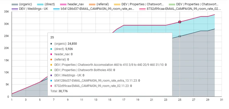
For Example: Consider a technology company tracking the allocation of its research and development budget across different projects each quarter. The stacked area chart would showcase the quarterly budget for each project as a layer, providing a clear depiction of how each project contributes to the total R&D expenditure.
3. 100% Stacked Area Chart:
The 100% Stacked Area Chart takes the concept of the stacked area chart a step further by normalizing the areas to 100%, providing a percentage-based view of each component’s contribution to the whole. This is particularly useful when comparing relative proportions or understanding the composition of a whole in percentage terms.
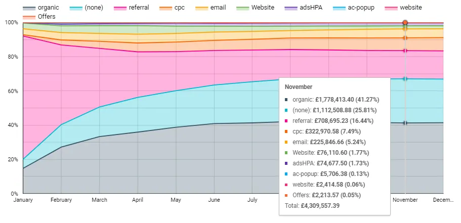
For Example: In a marketing context, imagine a company using a 100% stacked area chart to represent the distribution of its advertising budget across various channels over a year. This visualization would show the percentage share of the budget allocated to each channel, offering insights into the relative importance of different marketing avenues.
Tips and Tricks for Area Charts:
1. Color Coding: Utilize distinct colors for each series to enhance visual differentiation.
2. Tooltip Detailing: Provide detailed tooltips to offer additional context upon user interaction.
3. Proper Scaling: Align the y-axis scaling with data to prevent misinterpretation.
4. Data Grouping: Group similar data series for focused analysis.
5. Interactive Elements: Incorporate interactive features for a more engaging user experience.
Efficient Use Example of Area Chart:
Consider a marketing campaign analysis where an area chart is employed to showcase the performance of various advertising channels over several quarters. The chart provides a clear visual representation of how each channel’s impact contributes to the overall marketing strategy, aiding in strategic decision-making and resource allocation.