How-to / Google Data Studio
Scatter Charts in Looker Studio
Uses of Scatter Series from Looker Studios:
Scatter charts in Looker Studios are invaluable tools for visualizing relationships between two variables in a dataset. Widely employed across industries, they effectively convey correlations and identify patterns in the data. Scatter charts are particularly useful for tasks such as examining the correlation between marketing expenses and sales revenue or analyzing the relationship between employee engagement and productivity.
Advantages of Scatter Series for Data Visualization:
Scatter series provide a visual representation of the correlation between two variables, aiding in identifying trends, outliers, and clusters. Their simplicity enhances immediate comprehension, making them efficient for conveying the relationship between variables in datasets.
Clutter Avoidance in Scatter Series:
Looker Studio’s scatter charts are designed to avoid clutter by offering customization options. Users can adjust the marker size, use color coding to represent additional dimensions, and employ interactive elements for detailed exploration. This customization ensures a focused and interpretable visualization, enhancing the user’s ability to draw meaningful insights.
Types and Categories of Scatter Series in Looker Studios:
1. Scatter Chart:
A Scatter Chart is a fundamental tool for displaying individual data points on a two-dimensional graph. It is commonly used to showcase the relationship between two variables, such as plotting the correlation between advertising expenditure and customer acquisition. Each point on the chart represents a unique data entry, providing a clear visual representation of patterns.
For Example: Consider a sales analysis where a scatter chart is utilized to visualize the correlation between the number of sales calls made by a sales team and the corresponding revenue generated. Each point on the chart represents a specific day, showcasing the relationship between the two variables.
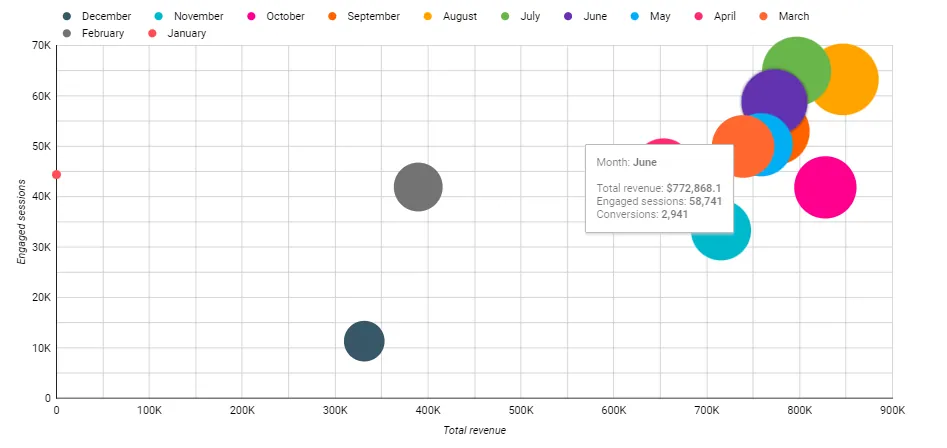
2. Bubble Chart:
A Bubble Chart is an extension of the scatter chart that introduces a third dimension through the size of the markers (bubbles). The size of each bubble represents an additional metric, adding depth to the visualization. This type of chart is valuable for scenarios where a third variable influences the relationship between the two main variables.
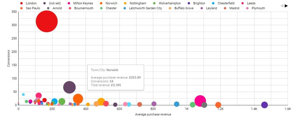
For Example: Imagine an analysis of product sales, where a bubble chart is employed to visualize the correlation between marketing spending, product price, and units sold. The size of each bubble represents the profit margin, providing a comprehensive view of the relationships within the dataset.
Navigating the Terrain of Scatter Charts and Bubble Charts
Scatter Charts: Unveiling Interrelationships in Two Dimensions
- Ideal for elucidating connections between two variables.
- Each plotted point signifies a unique data point, precisely positioned by X and Y coordinates.
- Renowned for revealing patterns, correlations, and trends within datasets.
Bubble Charts: Enhancing Insight through Dimensional Magnitude
- Expands on scatter charts by introducing a nuanced third dimension—bubble size.
- Bubble size, in addition to X and Y coordinates, encapsulates a third variable, augmenting informational depth.
- Facilitates simultaneous visualization and comparison of three variables within a dataset.
- A powerful instrument for comprehensive data analysis and interpretation.
Tips and Tricks for Scatter Series:
1. Marker Customization: Adjust marker size and color to represent additional dimensions.
2. Tooltip Enhancement: Provide detailed tooltips for each data point to offer context and insights.
3. Axis Scaling: Properly scale the axes to avoid distortion and present an accurate view of relationships.
4. Trendline Addition: Include trendlines for better visualization of the overall correlation between variables.
5. Interactive Exploration: Implement features like zooming and panning for users to explore the scatter plot in detail.
Efficient Use Example of Scatter Series:
Consider a scenario where a marketing team utilizes a scatter chart to analyze the correlation between the amount spent on digital advertising and the number of leads generated. The chart allows the team to identify patterns, outliers, and potential areas for optimization in their advertising strategy, facilitating data-driven decision-making.