Harnessing Insights with Looker Studio’s Waterfall Charts

Harnessing Insights with Looker Studio's Waterfall Charts

Waterfall charts in Looker Studios are powerful tools designed to illustrate the cumulative impact of sequentially introduced positive and negative values within a dataset. Widely applied in financial analysis, budgeting, and project management, waterfall charts provide a clear visualization of how individual components contribute to the overall total.

Advantages of Waterfall Charts for Data Visualization:

Waterfall charts offer a structured representation of data flow, allowing users to track the progression of values from one point to another. They are particularly effective in showcasing the composition of a whole and highlighting the magnitude and direction of each contributing factor.

Clutter Avoidance in Waterfall Charts:

Looker Studio’s waterfall charts are designed to avoid clutter through strategic visualization. Users can focus on key elements by adjusting the display of positive and negative values. This customization ensures that the chart remains concise and easily interpretable, enhancing the user’s ability to identify significant contributors.

Types and Categories of Waterfall Charts in Looker Studios:

1. Waterfall Chart:

A Waterfall Chart visualizes the incremental impact of positive and negative values on the total. It is often used to demonstrate changes in financial metrics, project budgets, or any sequential data set.
WaterfallChart

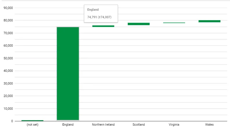
For Example: Consider a company analyzing its annual budget. The waterfall chart would showcase the starting budget, followed by increments for revenue and decrements for expenses, ultimately revealing the net budget at the end.

Tips and Tricks for Waterfall Charts:

1. Color Contrasts: Use distinct colors for positive and negative values to enhance differentiation.

2. Data Labels: Incorporate data labels to provide specific values at each step, aiding in precise interpretation.

3. Total Representation: Highlight the final total to emphasize the cumulative impact of all contributing factors.

4. Axis Scaling: Align the y-axis with data values to prevent distortion and maintain accuracy.

5. Annotations: Integrate annotations to explain specific points or changes within the waterfall structure.

Efficient Use Example of Waterfall Chart:

Imagine a project manager visualizing the budget allocation for a complex project using a waterfall chart. Each step in the chart represents a specific cost category or revenue stream, allowing for a detailed understanding of how individual factors contribute to the overall project budget. This visualization aids in budget optimization, resource allocation, and decision-making throughout the project lifecycle.

Leave a Comment

Your email address will not be published. Required fields are marked *