Sankey Charts in Looker Studio

Sankey Charts in Looker Studio

Sankey charts in Looker Studios are invaluable tools for visualizing complex relationships and flows within datasets. Widely applied across diverse industries, they efficiently communicate the distribution and transition of resources, providing insights into user journeys, energy flows, and process optimization.

Advantages of Sankey Charts for Data Visualization:

Sankey charts offer a visually engaging and intuitive representation of the interconnectedness within datasets. Their simplicity aids immediate comprehension, making them effective in illustrating the flow and distribution of data, uncovering bottlenecks, and identifying key transition points.

Clutter Avoidance in Sankey Charts:

Looker Studio’s Sankey charts are designed to avoid clutter by offering customization options. Users can selectively show or hide specific flows, adjust the thickness of links, and utilize color coding for clarity. This customization ensures that the chart remains focused and interpretable, enhancing the user’s ability to derive meaningful insights.

Types and Categories of Sankey Charts in Looker Studios:

1. Sankey Chart:

A Sankey Chart visualizes the flow of resources between multiple entities. Each entity is represented by a node, and the flows between them reveal the distribution or transition of resources. For example, it can effectively illustrate the distribution of budget allocations across different departments within an organization.
SankeyChart

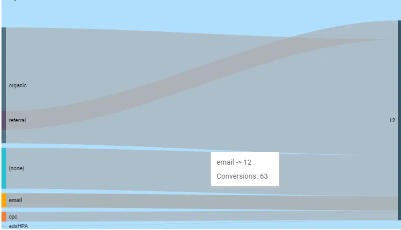
For Example: Consider a financial analysis where a Sankey chart is utilized to showcase the allocation of a company’s budget among various cost centers. Nodes represent departments, and the flows between them represent the financial distribution, providing a clear picture of resource allocation.

Tips and Tricks for Sankey Charts:

1. Node Labeling: Clearly label nodes to identify the entities involved in the flow.

2. Flow Color Coding: Use distinct colors for different flows to enhance visual differentiation.

3. Tooltip Detailing: Provide detailed tooltips for nodes and flows to offer additional context upon user interaction.

4. Proper Scaling: Adjust the scale of the chart to prevent distortion and present an accurate representation of the flow.

5. Interactive Elements: Incorporate interactive features, such as highlighting specific flows or nodes, to facilitate a more engaging user experience.

Efficient Use Example of Sankey Chart:

Imagine a supply chain management scenario where a Sankey chart is employed to visualize the movement of goods from suppliers to manufacturers, distributors, and retailers. The chart provides a dynamic representation of the entire supply chain, helping identify optimal routes, potential bottlenecks, and areas for efficiency improvement.

Leave a Comment

Your email address will not be published. Required fields are marked *